Sutter Health – A learning platform training physicians, social workers, and caregivers in The Grove model, featuring a defined brand, searchable library, and updatable course syllabus.
Designed by me, developed by Alex Nitta at Woodshed.
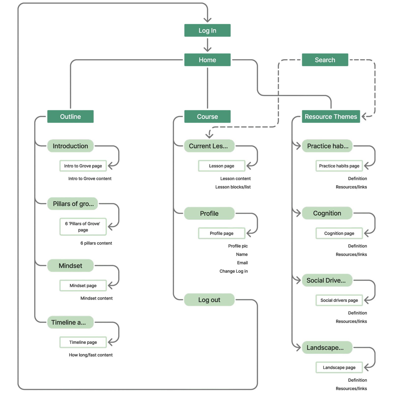
Information architecture
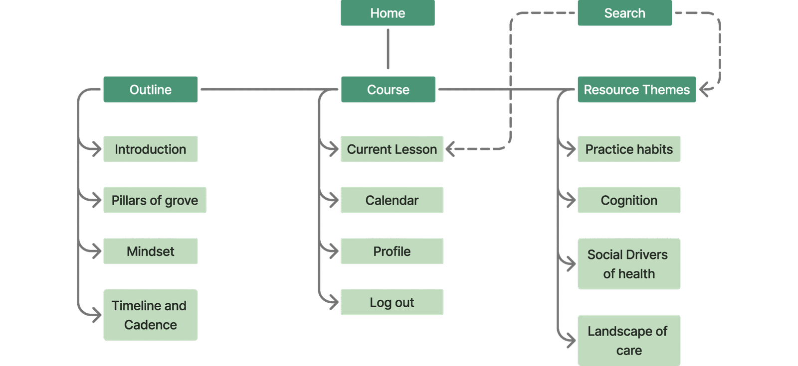
The early stages of this product focused on curating and auditing content, the goal being to make it as accessible as possible. To achieve that, I spent significant time designing an information strategy in close collaboration with both development and the course director.

Navigation

The information architecture heavily influenced the navigation design. Following the content audit and then a user survey, we chose to keep navigation visible—making the experience more approachable and reducing cognitive load.
Wireframes
Knowing to keep the navigation visible helped simplify the wireframing process. The layout followed a three-part structure: navigation on the left, content in the center, and a flexible details panel on the right. Starting with the course page set the foundation for organizing the site’s most content-heavy area.

To address questions from investors and the course director about content interaction, I developed previews across device breakpoints of key site areas to provide clarity and align expectations.
Design language
This project was guided by Grove’s mission: a community that cares for a community. I developed a simple, geometric design language reflecting Grove’s natural, interconnected care. The system aligns with Sutter Health’s brand while defining Grove’s distinct identity, with rebuilt Shoelace components ensuring consistency and efficiency.
Focus
To enhance readability and support sustained focus, lesson text was constrained to an optimal line length of 45–75 characters on desktops and large tablets. A custom 'Focus Mode' toggle was implemented to collapse all secondary navigation and peripheral UI, helping reduce cognitive load during learning sessions.
Search
Grove learning cohorts spend much of their time onsite with patients. In consideration of this, I carefully refined the user experience on mobile and tablet devices. In a patient environment, access to the resource library takes precedence, either through the search function or with a direct lookup.
Learnings
Simplicity
In complex health/learning environments, simplicity is clarity. I learned to really cut anything that didn’t serve the user’s goal, and to respect their limited time and cognitive load.
Cross-disciplinary collaboration
Working alongside medical professionals, educators, and developers showed me the power of shared language and iteration. I learned to facilitate alignment between teams with very different perspectives and priorities.
Get in touch!